Aa s child I actually started listening to "English music" with Linking Park.Hence its been a huge part of my growing up.With the recent untimely demise of the lead singer I felt that this was an opportunity to both pay a tribute while combining it with an essential element of my growing up.
The idea of the poster was to actually capture how the lyrics of the song show the anger one holds inside but tries not to let it out and how he might explode with all of this inside and when he does it will be very bad.
So when I started working with the poster I realised that one big block of mirror broken in the middle doesn't help with the composition as it covers most of the facial features failing to express the emotion.Keeping this in mind I then shifted the cracked elements away from the centre and towards the bottom left.
The main idea was to have two faces of the same man and the broken mirror acting as a medium to show both of his sides.
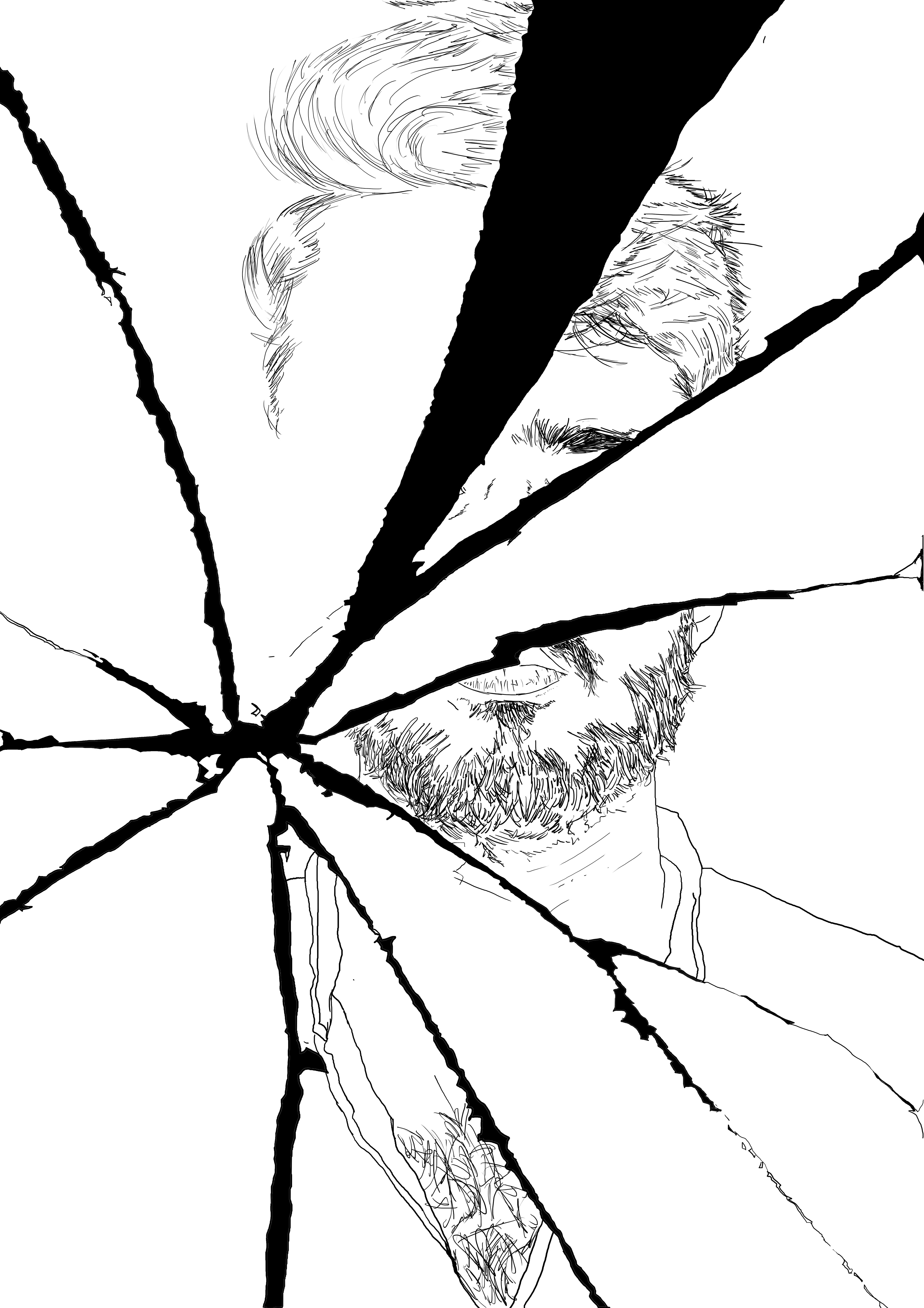
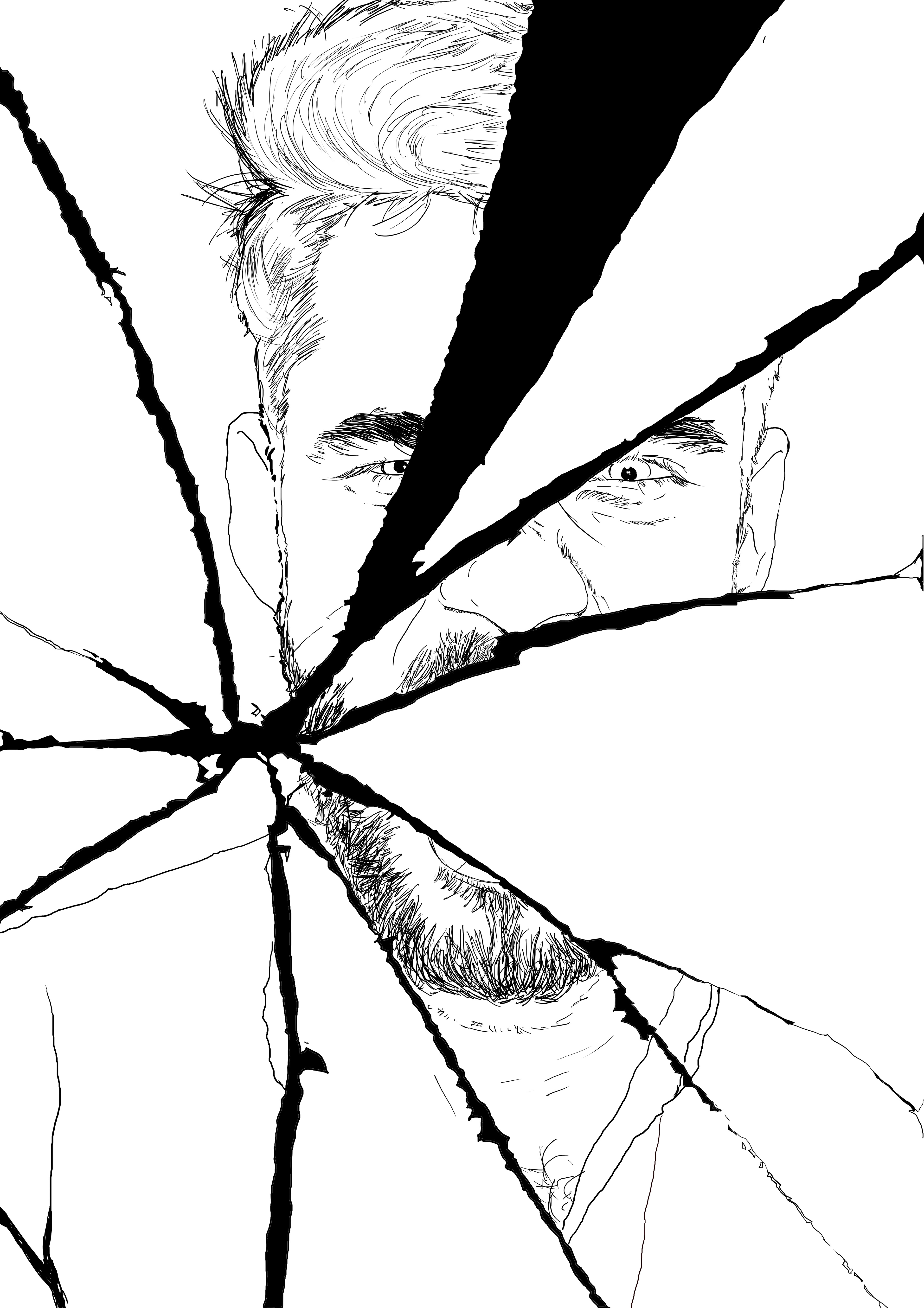
One side shows the man who stays calm and composed.The man who he shows to the world.
The other side shows the violent and aggressive side.The man who stores all of his anger inside, waiting for it to burst.
I next started working on choosing the colours.I made sure that the colours depicted my concept.Hence,I chose the colour as red to show the "angry side of the man"since red symbolises hatred, anger and aggression.Also the contrast I both sides is better visible due to the dark and light shades highlighting different identities.
I was satisfied with the outcome and a little impressed with myself as I it was an improvement for both me and my work.However,I realised that I had solely made the illustration and not ventured into the territory of typography.Therefore,I made a few changes and added the name of the song with the typeface "Orator".The poster still seemed to be incomplete so I added the name of the song and the artist in the bottom right corner of the illustration.
Final conclusions and reflections:
I DID FACE A LOT CHALLENGES AND LEARNT A LOT IN THE PROCESS NOT SPECIFICALLY RELATED TO THE ART PART OR THE DIGITAL PART OF WORK BUT ALSO THIS WAS THE FIRST TIME I GOT MY WORK PRINTED ON SUCH A BIG PAPER. ANOTHER THING I DEFINITELY WONT WANT TO REPEAT AGAIN WOULD BE TO MAKE NOT ENSURE MY DOCUMENTS ARE MADE ON RIGHT SIZED CANVASES SO THAT THE IMAGE QUALITY DOESN'T GET HARMED WHEN I TRY TO PRINT (SPECIALLY ON A BIG PAPER).ADDITIONALLY, I DIDN’T MENTION IT EARLIER BUT THIS TIME I CREATED MY WORK IN RGB FORMAT AND THE PRINTER WE WERE GETTING OUR PRINTS FROM ONLY CATERED TO CMYK FORMATS. AS A RESULT MY PRINT WAS A LITTLE DULL COMPARED TO WHAT I HAD CREATED.
EVEN THOUGH I FAILED SO MANY TIMES IN THE PROCESS AND MADE MANY MISTAKES IN THE MIDDLE I DID LEARN A LOT FROM THE PROCESS AND WOULD MAKE SURE NOT TO REPEAT THE MISTAKES AGAIN.THE FINAL POSTER WAS A COLLECTION OF WHAT I HAD LEARNT FROM THE DAY ONE OF THE CLASS WHICH INCLUDED TYPOGRAPHY, COLOR AND COMPOSITION.THE PROCESS WAS REALLY FUN AND THE COMMENTS ON THE FINAL OUTCOME WERE ALSO QUITE FLATTERING.
